Assignment 2:
Information Design and Implementation
Due Friday Feb 9th @ 5:00 PM
Problem 1: Recreating the Gmail inbox
The Gmail inbox is an example of excellent minimalist design. It uses layout, whitespace, contrast, and a little bit of color to create an interface that is usable and pleasant to look at for hours a day.
Your goal in this assignment is to discover and replicate the visual design as pictured in the following image:
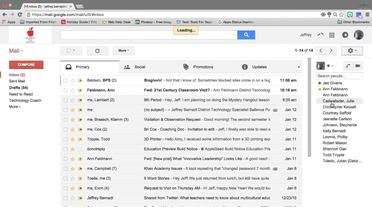
Open in new tab to enlarge.
Do not implement any of the functionality of Gmail, just the layout, HTML elements, whitespace, contrast and colors.
- 1. Please use HTML, CSS, and Bootstrap. Attach bootstrap using the following CDN:
- You do not need to include the exact images used in these examples. You don’t need to use any images at all. You can simply use colored DIVs in place of images. The colored DIVS should vaguely match the image color, but we don't want you to focus on the design of the images. Focus on the visual design of the other HTML elements.
- The sizes and spacing of the elements do not have to be exact, they merely need to be close enough to give the same overall feel to the visual design.
- Colors should be roughly the same hue and saturation, but do not need to match exactly. Again, the point is to get the overall feel of the visual design right.
- Although the real gmail interface stretches wider than the 12-column Bootstap grid, please use the 12-column Bootstrap grid and don’t worry about the stretchiness of the real Gmail.
- For the Primarhy/Social/Promotions/Update tabs, please use the bootstrap tab widget. Again, it doesn’t not need to be functional. This aspect of the design may not match as well as the rest because Bootstrap tabs are inherently a little different than the tabs Gmail uses.
- Replicate at least 5 rows of data in the image.
- We will test your deliverable in Google Chrome browser.
- Do not replicate the UI elements associated with the web broswer in the image. Those are there just for context.
<link rel="stylesheet" href="https://maxcdn.bootstrapcdn.com/bootstrap/3.3.7/css/bootstrap.min.css" integrity="sha384-BVYiiSIFeK1dGmJRAkycuHAHRg32OmUcww7on3RYdg4Va+PmSTsz/K68vbdEjh4u" crossorigin="anonymous">
DO NOT download and link to a local copy of bootstrap.
What to turn in:
- One HTML file and one CSS file that we can run without any additional downloads.
- Six screen shots of your final design that annotate ways you replicated the following six visual design tools:
- 1. Layout
- 2. Position
- 3. Size
- 4. Whitespace
- 5. Contrast
- 6. Color
Example: For the "layout" design tool, one annotation on your screen shot should probably show the grid lines, the names the conceptual groupings, and the sizes you allocated to the columns.
Each tool should have at least three annotations on its screen shot.
Each annotated screenshot should be a separate PDF.
Problem 2: Two information designs for a moving sale
Here is the text of a items for sale by the owner. Read the text about the moving sale below. Design and implement two different websites that display the same information according to two different messages:
- One site should emphasize the most expensive items. The seller really wants get as much money as possible, and will throw away the unsold items.
- One site should emphasize the breadth of items and that everything must go. The seller doesn't want to move or throw away any items.
For both designs, tell us:
- What are the most important bits of information in your information hierarchy? How does it connect to the message? What conceptual tools (grouping, layout, position, size, whitespace, contrast, color, images) did you use to implement that intention in your design?
- In what order to do you intend the reader to see the most important bits? Why? What conceptual tools (grouping, layout, position, size, whitespace, contrast, color, images) did you use to implement that intention in your design?
- What is one major way you used color in your design?
- What is one major way you used typography in your design?
- What is one major way you used gestalt in your design?
You should add images to your design that vaguely match the description.
You may make small changes to the text to fit the design, but remember that the goal is to convery meaning thru the visual design, not the text.
What to turn in:
For each site:
- A folder containing the HTML file, a CSS file, and images.
- A PDF of your write up with your answers to the questions.
Submit
Submit your HTML, CSS and PDF files to Courseworks.
Please post any questions about this assignment or others to the class Piazza forum.